The illustration is a pie graph depicting the results of
a final exam given to a hypothetical class of students.Each grade is
denoted by a "slice."The total of the percentages is equal to 100 (this
is important; if it were not, the accuracy of the graph would be
suspect).The total of the arc measures is equal to 360 degrees.
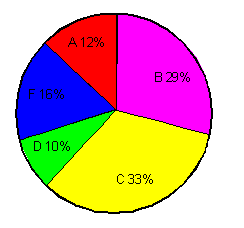
From this graph, one might gather that the professor for
this course was not especially lenient nor severe.It is evident that
grading was not done on a "pure curve" (in which case all the arcs would
have equal measures of 72 degrees, corresponding to 20%).If this graph
were compared with those of classes from other years that received the
same test from the same professor, some conclusions might be drawn about
intelligence changes among students over the years.If this graph were
compared with those of other classes in the same semester who had
received the same final exam but who had taken the course from different
professors, one might draw conclusions about the relative competence
and/or grading whims of the professors.